Tiny Impacts: The Case of the Accidental Archive
Tiny Impacts
First impressions make all the difference. In the mobile world of instant gratification, you have only minutes, and in many cases, seconds, to make that first connection with a newcomer. Apps have to be instantaneously understandable or suffer abandonment or the great and terrible Uninstall. There is not much threshold for frustration.
At Pocket we take a lot of pride in the small details and spend time tuning that first impression to avoid confusion or even the occasional rage quit. We have found that sometimes the most helpful changes can be the most subtle. Here’s one example from Max Weiner, a developer on the Android team.
The Case of the Accidental Archive
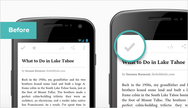
In our Android app, up until a few months ago, the Reader’s Action Bar (top toolbar) was the only place within the app where we did not use the Up Button convention. We want the reading and watching experience to be all about your content, we want to get out of the way, so we didn’t want yet another icon cluttering up the space—especially one that served a duplicate purpose of the hardware back button.
We placed all of the actions you could take on an article on the left side of the Action Bar, with the Archive Button in the leftmost spot. Tapping this button closes the Reader and moves the item from your list to your Archive.
Through user testing, we discovered that new users were instinctively tapping the Archive Button to go back, expecting the Up Button to be there. The Reader would close but the item they saved would disappear, and they would return to their list empty or missing their article.
Since they thought they were just going back, they didn’t realize that they also had sent the item to the Archive. This often elicited a “wtf just happened” reaction.
The subtle change of adding the Up Button convention and reorganizing the actions to the right side, completely eliminated the accidental archive and had a significant impact on this first impression.
Looking at people who opened an article in Pocket for the first time, and were presented with this toolbar, the Up Button change increased the likelihood they would continue using Pocket from this point onwards by 23%! That is a lot of frustration eliminated for a minor change.
Understand Expectations
We are now in an age where Android has clear and effective design. Gone are the days where every app looked and acted completely different in a great jumble of UX patterns. Android 4.0 brought with it clear style and patterns, and Android users have collectively developed expectations in regards to UX.
If changing the location of one button can make a big difference, I think the results of redesigning an entire app, still stuck in the pre Android 4.0 age, could be quite dramatic.
This isn’t to say you should follow the design guidelines as law. The key word there is guideline. You can still innovate with design, but just be aware of potential confusion if you go against expectations.
Max Weiner is Pocket’s Android Development lead and tweets at @XxXxXxXxXxam.